Trends in Website Hero Design
Sliders or carousels of scrolling images have enjoyed several years of popularity as website homepage staples. A few years ago, a substantial portion of websites used them in the all-important “hero” section at the top of the page. You may not be seeing sliders around as often these days, and perhaps you’re noticing that they start to feel a bit dated. At Stand And Stretch, we’ve moved away from sliders in favor of static hero sections. Let’s look at how sliders can hurt your website, what to use instead, and where sliders are still useful in web design.
Why Sliders Have Been So Popular in Web Design
Over the past few years, many web designers and theme developers have used sliders (AKA carousels) almost by default for homepage hero sections. You’ve seen them – it feels a bit like a PowerPoint presentation has taken over the top section of the website. Typically slides scroll automatically, cycling through 3-5 images with different headlines and taglines.

The homepage hero slider of this website includes a huge number of slides. Chances are the vast majority of users will never see anything past the first slide or two.
What made website sliders so popular?
One perceived advantage is that sliders can allow you to get more content into the same amount of vertical space by rotating the content. In theory, this maximizes that valuable “above the fold” space at the top of the page. For instance, you don’t have to choose one sale item to promote or one service to feature – you can give that prominent top real estate to several promotions or services in turn.
Others have argued that adding sliders introduces some motion to the site design, drawing the eye and creating interest and engagement.
Web design tends to be a trend-heavy field. As sliders gained popularity, more and more designers and developers included them in their work, because they saw them everywhere.
How Sliders Work in the Wild
In reality, sliders haven’t proven themselves to work as desired. Yes, you can incorporate more headlines and images into your hero section if you rotate them, but most users will only interact with the first slide before moving on. Worse, sliders can trigger “banner blindness” in your site visitors. Sliders share characteristics with ads, and this can make users more likely to ignore them. For instance, being located at the top of the page is common for both banner ads and sliders. And that eye-catching animation? That can trigger banner blindness as well because animation is so common in digital ads.
From a user experience standpoint, sliders have not withstood the test of time. Besides their resemblance to advertising content, sliders are resource intensive. Often sliders are integrated into WordPress with a plugin, and some of these plugins require a bunch of external JavaScript, slowing down your site’s performance. Even if you have a fairly lightweight plugin, or your carousel widget comes with your page builder, the content of the slider can be bad for performance. Each slide in your carousel is an additional image your site has to load. This can be a particularly painful drag on mobile site load times.
Sliders also tend to score poorly on web accessibility metrics. Controls, designed to be unobtrusive, are typically small and low-contrast. Auto-scroll behaviors are common since designers want users to have a chance to interact with each slide, but auto-scrolling is not considered a design best practice, as it removes agency from the user.
Sliders Are Bad For Conversions
Sliders don’t just create a sub-par user experience – they can also decrease how well your site converts.
There are two main reasons why sliders are bad for conversions. As we’ve discussed previously, sliders aren’t engaging to the user and can trigger banner blindness, so you are effectively pushing your main content further down the page. A web page that converts well puts primary goals and calls to action front and center. Users, especially mobile users, don’t want to invest a lot of time hunting around for the purpose of your site or the actions they can take. Hero section space is better used for carefully chosen elements like a single arresting image, a contact form, a compelling call to action, or a single time-sensitive promotion.
In addition to effectively pushing down your main content, sliders can also make the messaging of your site unclear. Suppose your company offers four primary services. If you put each service on a slide of your carousel, most users will only see the first slide or two, so they won’t get an accurate understanding of your service menu from your hero. A static hero section with a single focus forces designers and content creators to make more thoughtful choices about what to focus on. If you can only use each block of vertical space once, you have to do the challenging work of distilling a brand’s message effectively.
Finally, technical aspects of sliders can negatively impact your SEO (search engine optimization) metrics, which in turn can depress conversions. Slower site performance due to external JavaScript and large images can decrease your site’s rankings. Depending on how your slider is integrated, it is even possible that the text in the slider may not be crawlable, although this is certainly not always the case. Those four or five H1 heading tags might not be gaining traction with search engines. The SEO gurus at Yoast have been railing against sliders as an SEO nightmare for years now.
Alternatives to Sliders in Web Design
We’ve established that sliders are not the way to go for hero sections. So what should occupy that prime real estate on your webpage? Every business and organization is unique, so every website will look different. There is no magic formula that determines precisely which elements must appear where on your website.
However, at Stand And Stretch, our web design philosophy is that each homepage hero should include these critical elements:
- A clear indication of the purpose of the organization or person behind the site
- A prominent call to action
This framework ensures that each time a user lands on the homepage of a site, they will be presented with clear cues about the purpose of the site, and have immediate access to subsequent actions. Within these simple parameters, there is a huge amount of flexibility. An artist’s portfolio site might prominently feature a striking image of the artist, their name, and a button to purchase tickets to their latest museum installation. A hero section for a plumbing company would be more likely to include prominent emergency service call contact information and a heading with value proposition copy like “Trusted Plumbing Services for 50 Years.”
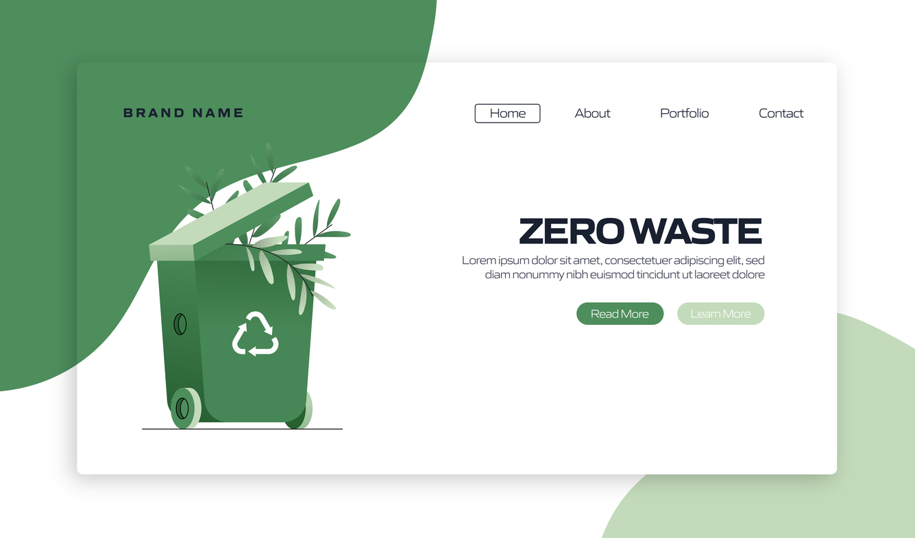
This landing page concept features a static hero section rather than a slider. The message of the page is clearer and the site will likely convert better due to greater clarity and efficiency.
Whether a site exists to sell a product or a service, promote an organization or idea, or for any other reason, users feel satisfaction when they can clearly understand the purpose of the site and the actions available to them.
When Sliders Maybe Helpful in Web Design
We’ve been pretty hard on sliders as hero elements – and even argued that they should be dethroned and replaced with static images and calls to action. But we don’t think that image carousels are always a bad idea. In fact, they can serve applicable purposes in several scenarios.
One of the most useful applications for sliders is in e-commerce situations. It’s pretty intuitive for shoppers to see a row of products with arrow navigation and realize that they can scroll horizontally for more options. This is an example of a time when carousels truly can maximize vertical space. Since your user is shopping on an e-commerce site and likely to be familiar with this mechanic, you’re not running great risks of triggering banner blindness with a well-designed carousel of products.
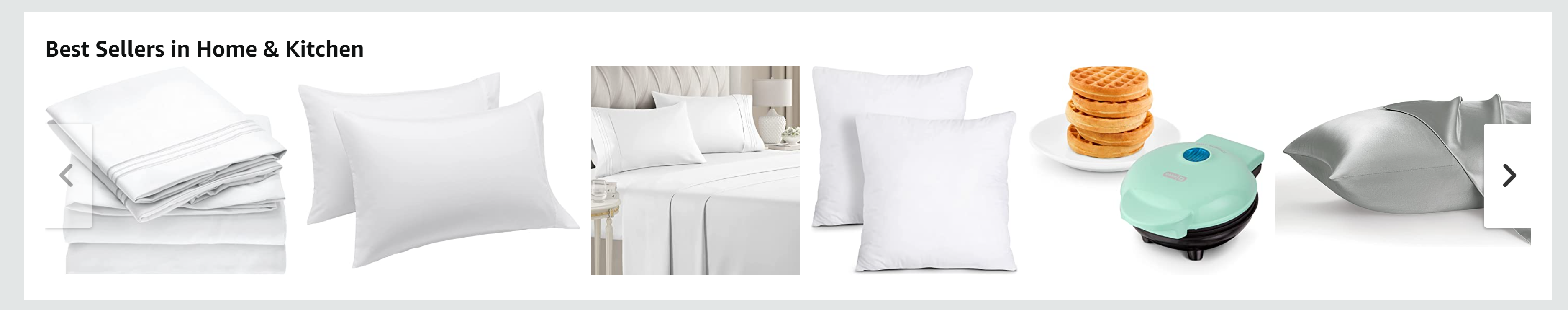
This product carousel on the Amazon.com site is an example of an appropriate use of a slider.
Another scenario where a slider can be appropriate is for saving space with lower-priority content. For instance, you include a testimonial section above the footer of your webpage, below your primary page content. You have several glowing reviews you’d like to include, but you don’t think it’s likely that everyone will want to read all of them. A carousel is an appropriate way to include all of this content, so users who want to just glance over one review can, while others can choose to cycle through and read all of the reviews. Your hero content is the most important element of your webpage, so you don’t want to give users the chance to skip over it, or give yourself an excuse to not craft a crystal clear message. But with lower-priority, below-the-fold content, a slider can sometimes be an acceptable way to include more information.
Does My Hero Section Need an Update?
If your hero section is relying on a rotating carousel or other outdated design elements, it might be time to give your site a facelift, or even redesign it. Not sure if your site is user-friendly, or how your SEO performance stacks up?
Reach out to Stand And Stretch for a free website review, and let us take a look at your site’s strengths and weaknesses.

Neva manages the day-to-day of the web department, takes the lead on production for web design, and helps clients develop content for new web projects. She also assists in a variety of our digital marketing and SEO services. When she’s not designing websites, she enjoys yoga, hiking, reading classic novels, and baking.